How to Optimize Landing Page Sliders
Marketing automation isn’t just about lead management – well it is, but it’s also about finding out how to get those leads into your funnel and keep them there. One of the most critical and overlooked metrics related to lead management is your individual pages’ bounce rates.
We’ve talked about bounce rates before. Yes, you need to lower them. Yes, you need to be able to see that clients are staying engaged and your site design and layout aren’t prohibitive to that. However, there are some things you could be doing with your landing pages that are prohibitive, and you don’t even know about them. Today we’ll be focusing in on one aspect of a landing page that plenty of advertisers aren’t really thinking about when it comes to their own sites. Let’s show you how to optimize landing page content and sliders in this article.
The Landing Page Slider
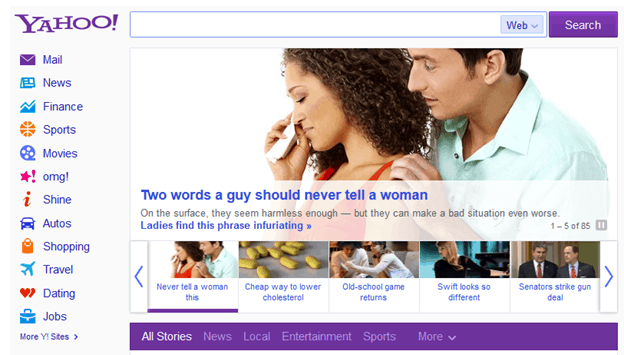
A slider is one of those slideshow-type deals on your landing page that allows customers to click through a series of side-scrolling images. Some sliders change automatically without the user needing to engage. Yahoo News has one:
For a news site, the slider is a great idea. Different content on the site is highlighted and the user has the ability to click to a news story that catches their individual interests.
These days, business websites that sell products and services also feature the slider. If your company sells retail products – much like a news site – it makes sense to utilize a slider. You can use the images to let customers know about special promotions, featured products or just to generate interest in a particular product category.
Sliders for Service Websites
Consulting and service oriented websites don’t have it so easy. If your site was designed by a company that isn’t concerned with branding you, or if you’ve uploaded images to the slider yourself, you may be using stock images that aren’t necessarily reflective of your branding or what you have to offer.
Many of these sliders take up most of the page they’re featured on. They tend to make a website look slick and modern – but if they’re taking up the entire page above the fold, your users aren’t really getting anything from them but pretty pictures.
Optimizing Your Sliders
If your landing page features a slider, you really have two options. You can either nix the slider altogether and have your web designer create something new – or you can optimize the images you’re putting into the slider.
For instance, if you’re selling marketing consulting services and one of your slider images is your logo, try changing up or adding text to the logo that really pushes your products. Ensure this text contains some sort of call to action,
“Learn why Lead Liaison Services is the Best out There.”
“Read Customer Reviews to discover why Lead Liaison is the Best Choice.”
The idea behind customizing the sliders is not just to add a different look to your landing page, but to get a click-through to a different page that details your products and services. This strategy is intended to decrease your bounce rate by allowing customers to learn more about you and go to a page with a higher chance of capture. The secondary page should feature a form to fill out or a number to call so you have a better chance of capturing customer info.
Lead Liaison staff can hook you up with analytical tools that will help you keep track of your landing pages – how they perform, what you could do better and how to integrate landing page metrics into the rest of your marketing via an advanced marketing automation interface. Find out more today! We’d love to help you.


